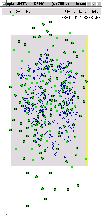
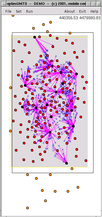
Before starting the simple search algorithm, the main window looks like the figure on the left hand side. The figure on the right hand side shows the result of the optimization run.
|
|
The base stations belonging to the optimized system are drawn in black, the unused base stations are drawn in red. The connection established between a mobile user and a base station is drawn with a pink line.